This blog post is an update to the original post from November 2013
Don’t get me wrong, I prefer story points and velocity to masses of up-front analysis and estimation. But I feel that Kanban goes one step further and employs maths as a basis for its estimates. Unlike financial investments, I’m happy enough that past performance is a guide for the future performance on most software development projects.
A number of reports are employed to tell us:
- Average time from start to finish (Lead Time) and/or average time from point A to point B (Cycle Time)
- Insights into variation of the above time
- Varying confidence levels against estimates
- Whether your flow is steady, or if you’re heading for a flood of work at a particular stage (i.e. a bottle-neck) or are facing a drought of work
Do I hear you complain that the overhead for obtaining this information is too much? Well, all you need to record is the date work items enter each state in your process (e.g. the date you start working on it, when it enters test, and when it is released).
Armed with this data, you can then create a Cumulative Flow Diagram, Scatterplot and Histogram.
Cumulative Flow Diagram

The CFD is made up of daily snapshots of your board: each day, you calculate the number of items in each state and plot them accumulatively on top of one another (starting with completed at the bottom and working up to the start of the process). In the example above, on the 8th June 2015, there were 22 items in Done, 3 items in Ready To Merge, 2 items in Test, 3 items in Code Review and 3 items in In Development.
These snapshots then build up to give you a view of the flow of your work: diverging seams show an impending bottle-neck for a particular state; converging seams shows work is drying up for the state.
Think of them a bit like a geological slice of the earth, but for your team’s flow of work.
Scatterplot
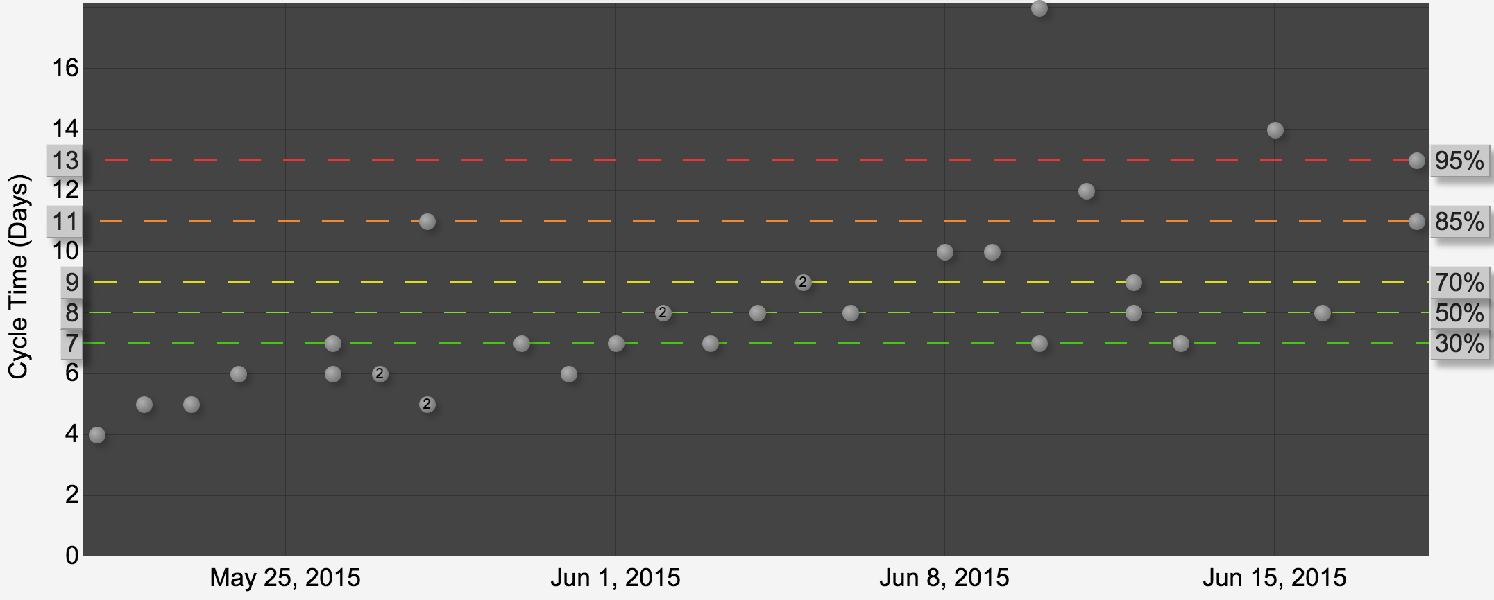
Using the start and end dates for each work item, the scatterplot plots how long each work item took (y axis) as time progresses (x axis). This shows if your work items are taking longer as time progresses but also gives you percentile lines to show you where various percentage of all items fall. e.g. In the example above, 85% of our items took 11 days or less.
This chart allows you to investigate work items that fall above the various percentile lines to see if there are clues to how best to improve your system. The real goal here though is to reduce variation in your delivery.
Histogram
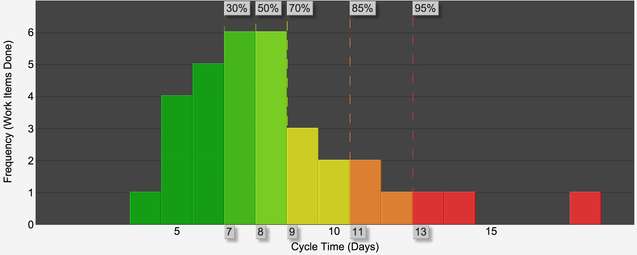
The Histogram shows how many items (y axis) took 1 day, 2 days, 3 days, and so on (x axis). If your output is consistent, you should see a bell curve around your average Lead Time … or not if you have a wide variation.
Similar to the scatterplot, the histogram also marks various percentile lines. e.g. In the example above, 85% of our items took 11 days or less.
We can use this as a guide to predict when a new work item of similar scale may be completed. More guarantee required? Use 95% confidence figure (as this is when most work items have been completed by), but note that a new work item might take longer than this or might be much quicker – we are using work items that have been completed in the past as a guide so is no guarantee of future performance. But it’s good enough for me.
There are a lot more in-depth explanations of these charts, but hopefully that has provided a useful overview.
Pingback: Drum-Buffer-Rope | Scrum & Kanban