Let’s pretend that your data (it could be anything, but those who know Kanban might want to pretend it’s Lead Time) is: 13, 18, 13, 14, 13, 16, 14, 21,13
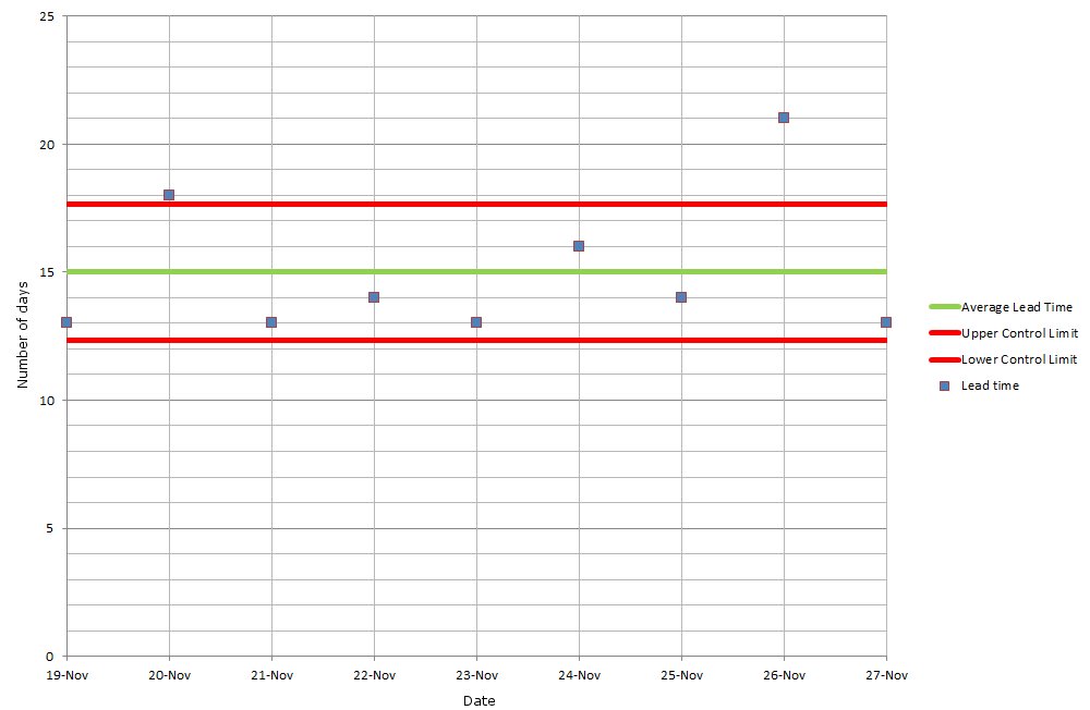
The control chart that results from that data looks something like this:
So what are those two red lines? What do ‘Upper Control Limit’ and ‘Lower Control Limit’ refer to? Well, they denote one standard deviation from the Mean.
What?!
‘Mean‘ is the average of your data: the sum of the above is 135 (13 + 18 + 13 + 14 + 13 + 16 + 14 + 21 + 13 = 135). Divide this sum by the number of items, and you get an average, or Mean, of 15 (135 / 9 = 15).
‘One standard deviation‘, aka one sigma, shows the boundaries between which the majority (68%) of your data sits – by referencing a margin either side of your Mean. Our example has a mean of 15, with one standard deviation of 2.67. This would usually be referred to as 15 +/- 2.67 (often rounded up to be 15 +/- 3).
The idea is that it helps you identify outliers in your data (i.e. anything below 12.33 or above 17.67). It’s these outliers that need to be checked and the causes eradicated. For more about this, see my previous post.
But how is standard deviation calculated?
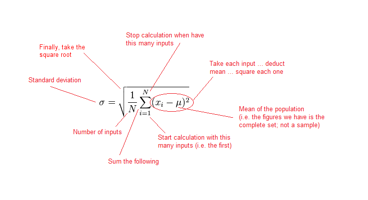
If you’re a maths genius, then the formula is:
If that looks like something out of A Beautiful Mind, then here is an explanation, in ‘normal’ language, of what each bit means:
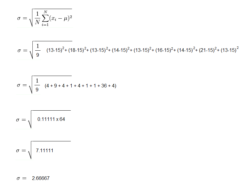
So, let’s work through the formula using our example data:
So there you have it: that’s how you calculate one standard deviation. Now that you know how to do it manually … you can use this very useful standard deviation calculator.


In your image of the equation that has all the part explained in red, you have the label “Square it at the end” on the square root sign. It probably should read something like “Take the square root at the end”.
You are not wrong Chris: I have changed it. Thanks for that.