In my recent post, I talked about Dan Vacanti’s take on Kanban charts. Some of his beliefs mean that our legacy charts are no longer workable.
So what can we use to track dates, view scatterplots, check arrival vs departure rates, etc?
Vacanti’s company has built a tool called ActionableAgile Analytics tool which allows you to upload your data (as xlsx or csv), or link directly into Jira and other ALMs, in order to produce a wealth of reports. Here’s a summary:
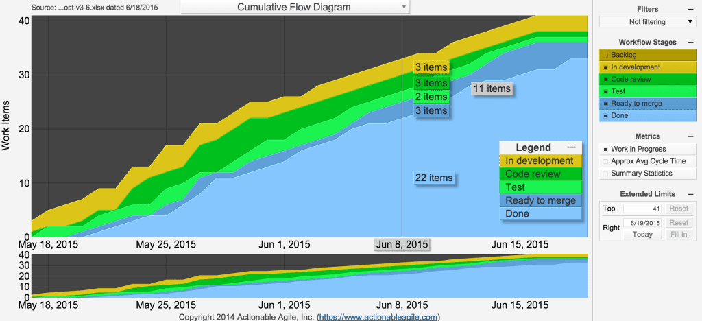
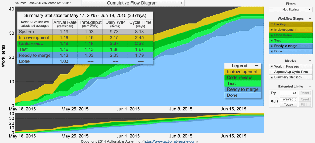
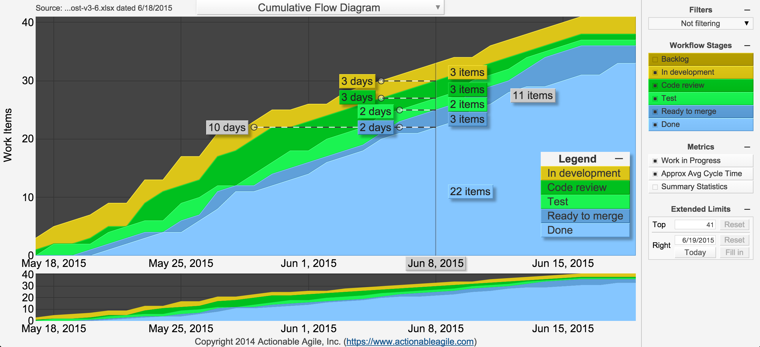
Cumulative Flow Diagram
Showing work items that are ‘in progress’ and ‘Done’, the CFD also provides a wealth of data, including work in progress and approximate average cycle time for each day (also broken down per band too).

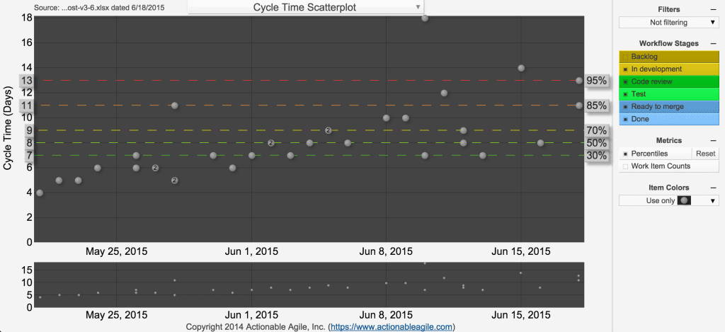
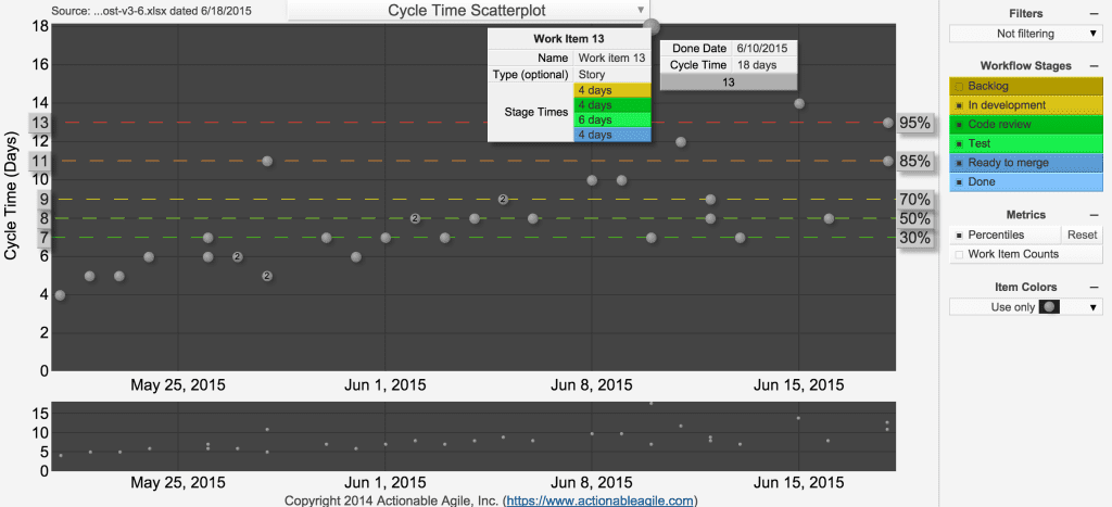
Scatterplot
Vacanti has made a good argument for showing standard percentile lines rather than averages and standard deviations. This chart allows you to choose your own percentiles, if you don’t like the default settings, with a simple drag-and-drop. You can also click on each data point to see a breakdown of how long a work item took in each stage of your process.
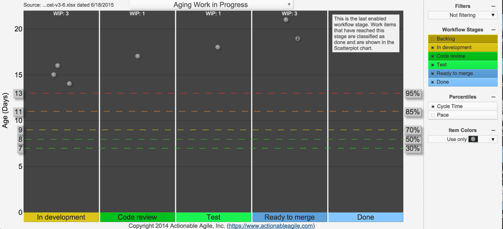
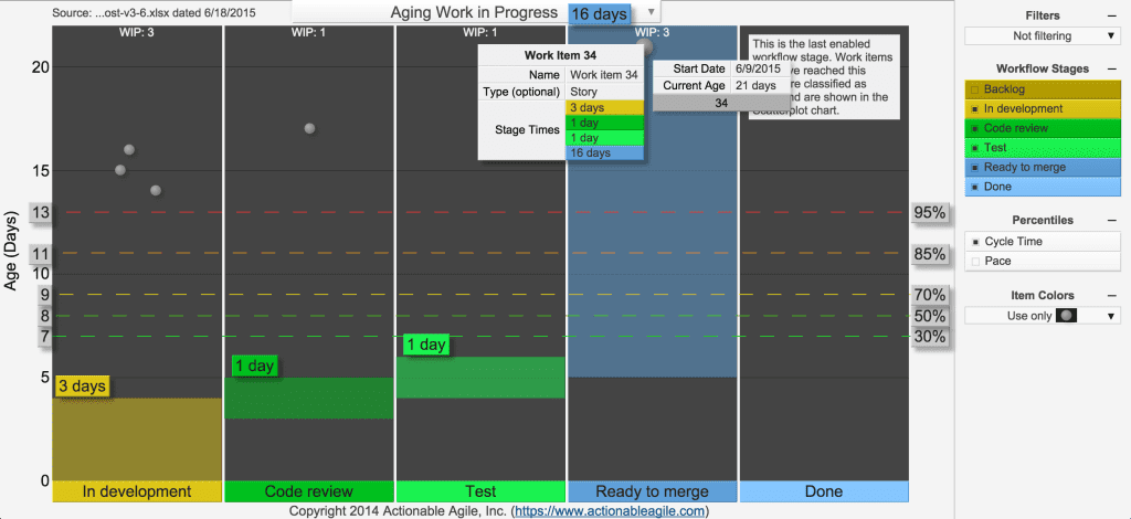
Ageing
I’ve not seen one of these before. It plots work items that are still in progress (i.e. not completed) according to the state they are currently in. The y-axis represents the total time it has been in progress. I wasn’t really sure about this chart, but Vacanti explained that it helps teams see how items are progressing against SLAs and has “become one of the most popular amongst our existing clients as most teams bring this chart up in their standup to discuss items that are currently or about to be in trouble”.
Histogram
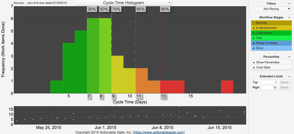
An effective histogram which shows fixed standard percentile lines (it doesn’t currently allow you to drag them like the scatterplots, but Vacanti tells me this is coming soon). An added feature is that it allows you to colour code the segments according to the percentile groups.
Linear Throughput Projection
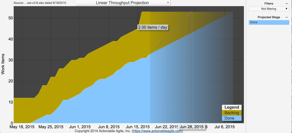
Despite Vacanti’s dislike of projection charts, there is one available: it plots outstanding work items against delivery rate and cycle time. As Vacanti said in his book, that’s okay for a “quick gut check on project status”.
Monte Carlo Simulators
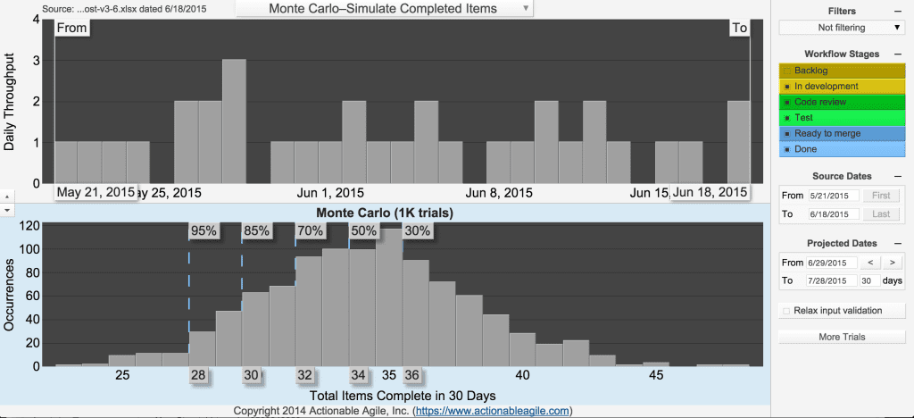
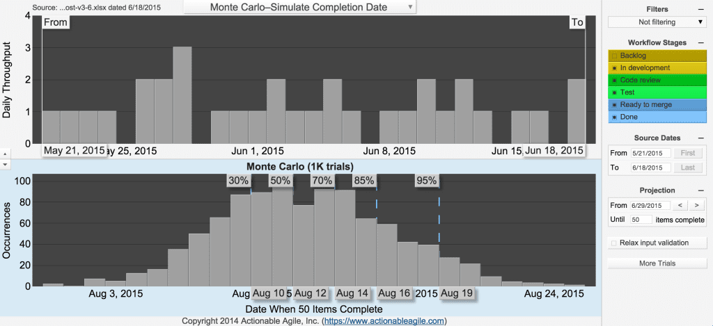
As of today, two new charts are available. The first (‘Monte Carlo-Simulate Completed Items’) allows you to simulate how many items are likely to complete by a date of your choice. The other (‘Monte Carlo-Simulate Completion Date’) allows you to state the number of items you want to complete, and the simulation churns out the likely dates they will be done by.
Conclusion
It is a well thought through suite of reports, although not the prettiest one. I think it’s fairly priced at $19 per month per user.
Whilst formatting is relatively easy, it would be good if it was a bit more flexible in the date formats it recognises [update: I’m talking to Vacanti to see if this can be built in]. I think it’s a shame that you cannot enter data directly into the tool: this means that you have to use another system alongside it and then connect the two [update: Vacanti has since explained that “most of our existing clients want to integrate with an existing tool (e.g. Jira) so this hasn’t been a priority for us”. However, he says that integration with Google Docs will be coming soon].
If you want to have a go with the ActionableAgile Analytics tool, you can use their pre-loaded data in their demo or sign up to a 14-day free trial and upload your own data.
Vacanti has also told me that there are plans for a debt flow chart which will be coming soon. We had a discussion about the self-hosted option which, apparently, a lot of clients ask for. However, I can’t see why this is better than a service. Are people that paranoid about using a service to create charts on their data? Why not just remove the names of stories before loading up the data?