In our new series, we ask people to talk us through how they visualise their work flow. First off the bat is Sky’s Mattia Battiston.
Our Context
We are a stable team of 5-6 developers, 2 testers, 1 business analyst, 1 team leader. We look after a family of applications to cover a whole business proposition. We are all colocated.
Our board(s)
We try to visualise our whole process, from project initiation to work being released in production – as close to reality as possible. We love using physical boards as they allow us to be extremely flexible and represent things that electronic tools struggle to do.
We do use Jira as well, but the physical board represents the truth.
Backlogs board

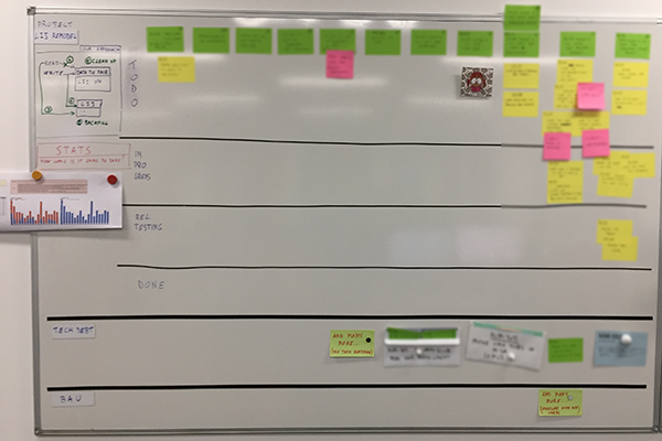
On the left board we visualise our backlogs. It’s split into 3 swim lanes to represent the 3 sources of demand that we have: project work (whichever project or program we’re currently working on), technical work, and BAU work. The cards closer to the right have higher priority, as they are closer to the column called “Next”. Next to the project work we print a copy of our past throughput and our forecast of when we think we might complete the project.
WIP placeholders

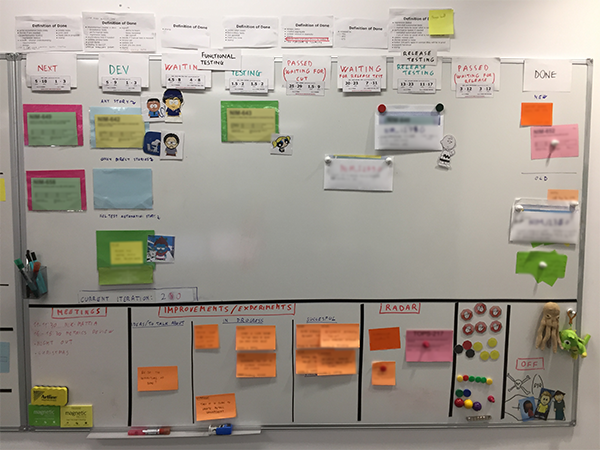
On the main board, we use physical placeholders to represent our WIP limits – you can only put cards in one of the empty placeholders. Seeing an empty placeholder is our pull signal.
Our current WIP limits are: 2 in next, 3 in dev (with some special policies about what is allowed to go in each slot), 1 in functional testing (across “waiting” and “testing”).
“Next” column
This is our first column with a WIP limit (2 at the moment) and represents our commitment point. Whenever we have an empty slot the team has a conversation about what is the next top priority. Our lead time starts here (as stories in backlogs are options that might never be worked on).
Buffers
We use buffer states: “waiting for functional testing”, “waiting for cut”, etc. They help us represent the queues that naturally happen in reality. Unfortunately, we have to synchronise with an external process. In particular, for stories to move from “Waiting for Cut” into “Waiting for Release Testing” we have to wait for the end of the iteration, which is synchronised across multiple teams. All teams then release in the same test environment where some end-to-end testing will happen. Similarly, when stories are in “Waiting for Release” we have to wait until the next release slots, which is usually a release night that happens once a month, before they move to Done.
These columns allow us to see if queues are growing and how long stories spend in non-value-adding states. WIP limits prevent work from accumulating in these buffers. For example, we have a WIP limit of one between the two columns “Waiting for Functional Testing” and “Functional Testing”. Also, the team is quite mature and would act as soon as a bottleneck appears.
Exit criteria
On top of each column we have exit criteria identifying what has to be done before a card can move to the next column. In a true pull system, these should be entry criteria (identifying what has to happen before a card can be pulled into the column); we tried writing them as entry criteria but the team felt that they were easier to understand when expressed as exit.
New/Old Done
The “Done” column is split into “new” and “old”. When something moves to Done it goes into “new” until the next morning we mention it at standup, and then it moves to “old”. This helps us spot what has just moved to Done so that we can mention it at standup.
Avatars
Each member of the team has got one avatar that is placed on top of the story they’re working on.
Printed cards
We print our stories on index cards so that they follow a standard format and the text is big enough to be seen from a distance.
Metrics dates on cards
At the bottom of each card we print a grid where people record the date when a card moves from one state to another. We then use this data to generate a huge amount of extremely useful metrics and forecasts.
Disney Stations

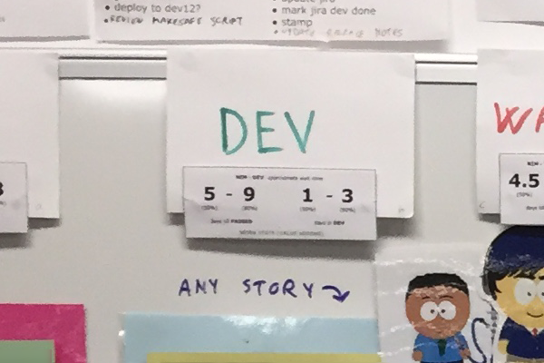
Using our metrics, on each column we provide percentile data on the average time work items stay in the state and the average time items take to reach the “Done” column from here.
Red/Green states
The name of each column is written either in red or green, to represent whether we consider that column to be a value-adding state or a queue. we then look at the percentage of time spent in each value-adding state. This is a low-cost way of us trying to improve our flow efficiency. Although there is the potential risk that something is in dev but not being worked on, we keep WIP low to try to reduce this as much as possible.
Blockers
When a story is blocked we leave it where it is and put a “blocker” tag on it. It still counts towards our WIP limits, as this encourages the team to give priority to resolving the blocker rather than starting something else.
Health status
Using our historical data we know when a story has being in progress (i.e. time from when it left the “Next” column) for longer than usual. We use yellow, red and black tags to represent the health status of a story. When a story has been in progress for 5 days it becomes yellow; after 8 days it’s red, and after 10 days it’s black. It helps people decide what to give priority to and whether we need to swarm on a story. In reality, we rarely use this because our WIP is low and we collaborate well, so items generally flow well through the system.
Frank
We have a mascot called Frank with some magnets on the back. At standup we walk the board from right to left placing Frank on each story to signal that we’re talking about it.

As additional notes to the post:
Special policies in development
In development we have special policies about what type of story can go in which slot: in the top one we can put any type of story, but in the middle one we can only put “direct” stories (stories that go directly from dev to done), and in the bottom we only allow “test automation” stories (that only testers are allowed to work on).
Envelopes for batches
After a cut of our application stories move in batch to go through release testing and be released. We visualise this by using a big envelope that contains all the stories included in that cut, and we call it “Version_XXX”
Teslamazing
Those times when we can’t/don’t want to print a card (e.g. something quickly to remember, or something that is not a story) we use Teslamazing notes instead of normal sticky notes. They are static and stick to any surface for a very long time, so we never get flying post-its anymore and the board is always neat and tidy
Magnetic strips
Instead of drawing the lines on the board (or using tape) we use magnetic strips. We love them because they are extremely easy to move and allow us to change the layout of your board very quickly, letting us experiment with many ideas.
Magnetic strips come in all sort of shapes and sizes. My favourites are: Magnetic Discs Thin strip Thick strip Labels Sticky strip
Bottom area of the board
This area is dedicated to a miscellaneous of things:
Awesome post, Mattia. Thanks for sharing.