
One of the key practices of Anderson’s Kanban Method is “visualise the workflow”. Many people insist that we’ve been doing this from the early years of Scrum via Scrum boards. However, I suggest that most teams are only just scratching the surface of what is possible, and many need a revamp to reflect modern development practices.
Why?
When I first started using Scrum in the mid-2000s, our development tended to be quite sequential. It went something like this:
- Backlog
- Ready
- In development
- Code review
- Testing
- Released
- User feedback
Although it pre-dates Scrum and even XP (Kent Beck claims he rediscovered it), the popularity of Test-Driven Development has certainly increased in recent years. If you want to show anything more detailed than ‘In progress’ for the process in between pre- and post-development states, TDD (and similar approaches where you run tests from the start) inserts problems into a sequential-based visualisation.
So what can you do?
Whilst at Government Digital Service, I helped a non-tech team solve a similar problem: they were re-designing content, but their process was non-sequential. For example, sometimes A was done before B, other times B was done before A, sometimes A and B were done simultaneously, and sometimes A wasn’t needed at all. A purely sequential visualisation was clearly not optimal for this team.
Probably because they weren’t carrying the baggage of previous agile implementations, the team was quick to find a solution: no longer was it the sole responsibility of the board to reflect progress, it became the job of the ticket.
The Powerful Ticket
As well as standard information (such as ticket title, people working on it, who would review it, product owner, deadline), the ticket had five circles along the bottom. Each circle represented one of the five elements that might be needed: workshop, user needs, content plan, specialist, mainstream. For each ticket, we circled only the elements that were needed, leaving unnecessary steps blank.
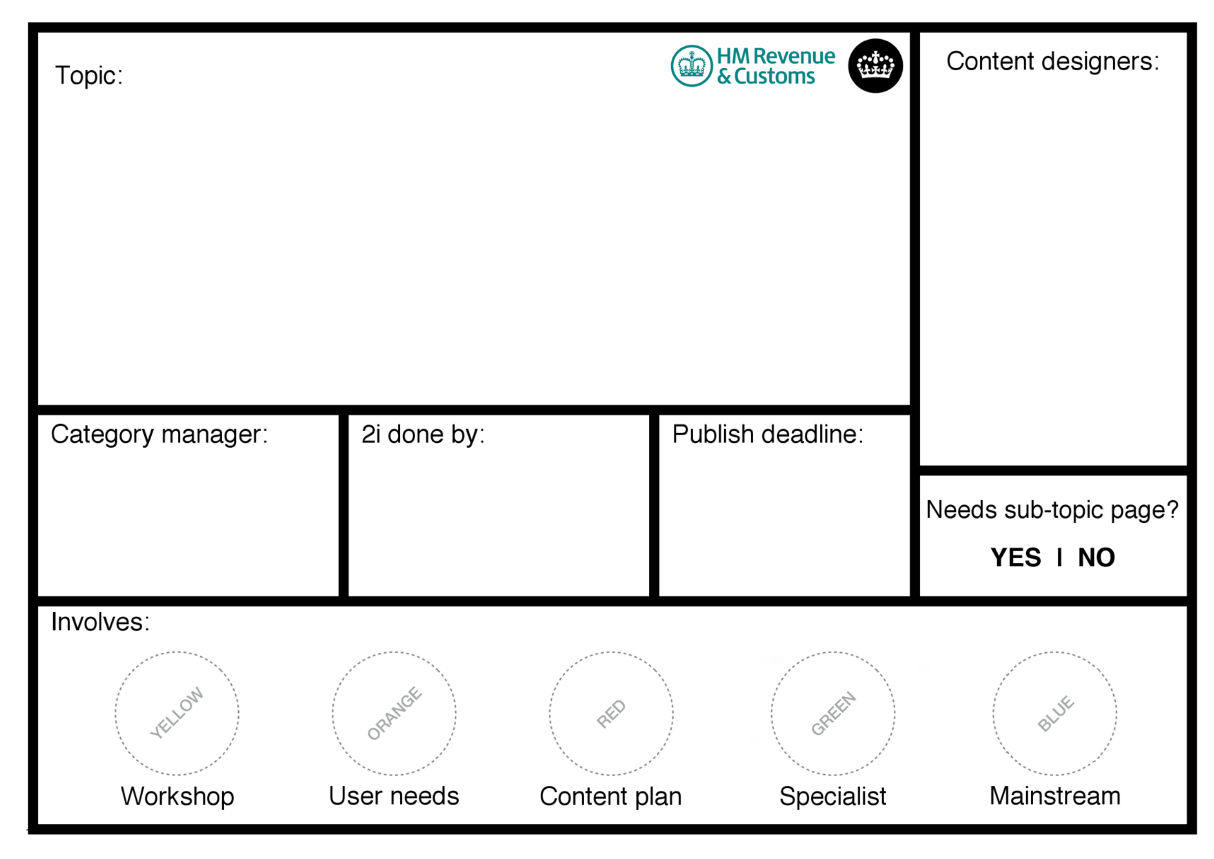
A blank ticket from GDS
When each step was complete, we would fill the in circle using a sticker. We decided to give each element different colours so it was even easier to see what was required and what had been completed. (Similar to the sense of accomplishment that moving a card through a process gives, it appears that the sticking of stickers once work has been completed is quite motivational. Clearly the allure of stickers from childhood doesn’t leave us: we might get older, but it appears we don’t grow up!)
I know this isn’t a ground-breaking advancement for humankind, but if your process isn’t easy to represent sequentially, it is worth considering alternative approaches like this to visualise your workflow. You might not use the card to replace your entire workflow. In my example, the cards were omnipotent in only one column; after all 5 elements had been completed, the card moved through a more traditional, sequential workflow.
Are you using alternative methods to track progress? We’d love to hear your stories.
In my example, the cards were omnipotent in only one column; after all 5 elements had been completed, the card moved through a more traditional, sequential workflow.